Event branding case study: AI & Digital Music Economy Hackathon 2025.
Creative direction and event experience design for a national innovation event exploring how AI can help close data gaps in the music and creative economy.
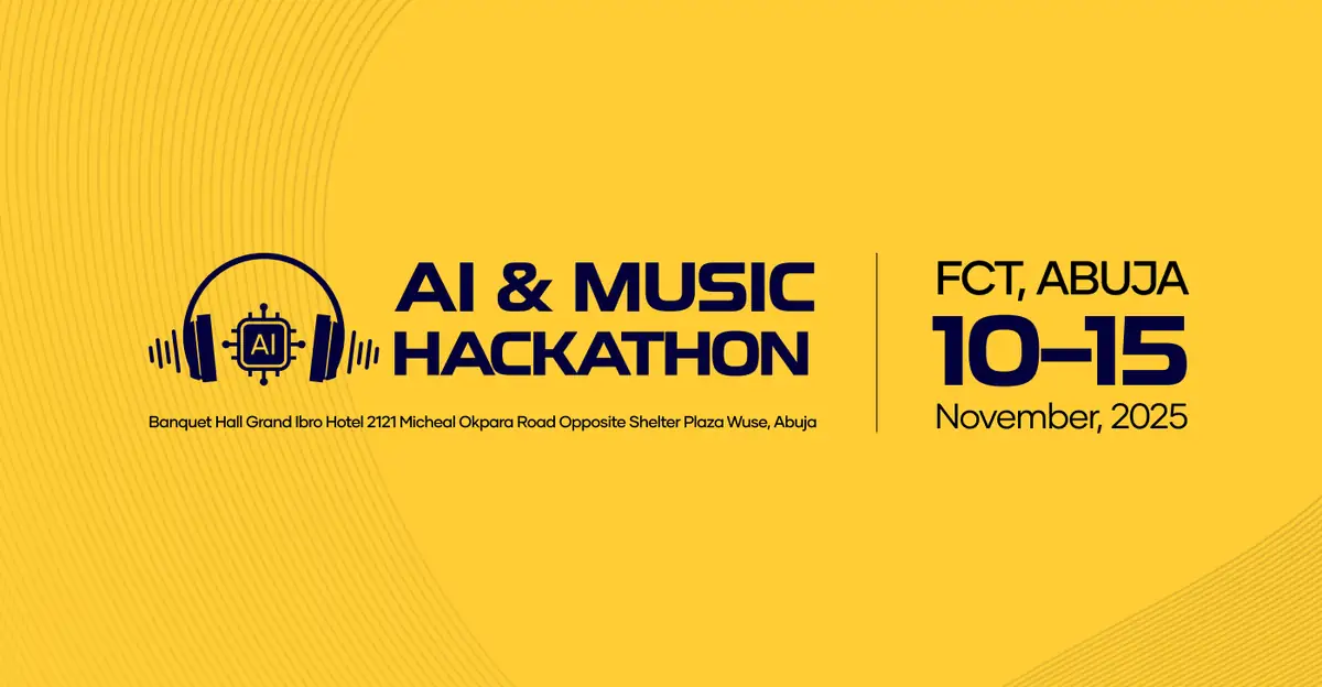
- Role
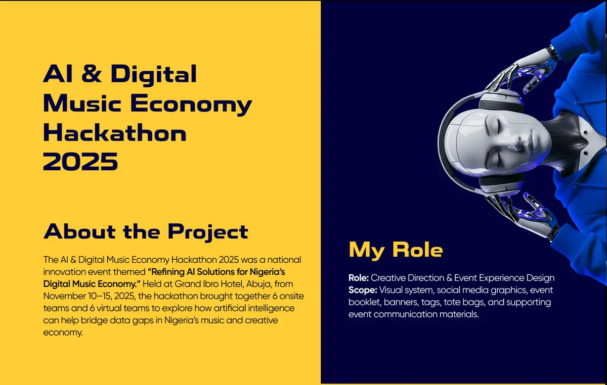
- Creative direction & event experience design
- Dates
- 10 to 15 November 2025
- Format
- 6 onsite and 6 virtual teams
- Scope
- Visual system, social, print, merchandise, signage
Byla Digital created the visual identity for the AI & Digital Music Economy Hackathon 2025, a six-day event for twelve teams. One system of type, colour and layout ran across social media, live screens, billboards, a detailed event booklet, badges, tote bags and apparel. It stayed recognisable from the first announcement to the final pitch.
The brief: one event, one visual language.
The theme was "Refining AI Solutions for Nigeria's Digital Music Economy." The identity had to build interest before the event, guide participants during it, and stay coherent across physical and digital formats.
The work covered the visual system, social media graphics, event booklet, banners, tags, tote bags and the supporting event communication.
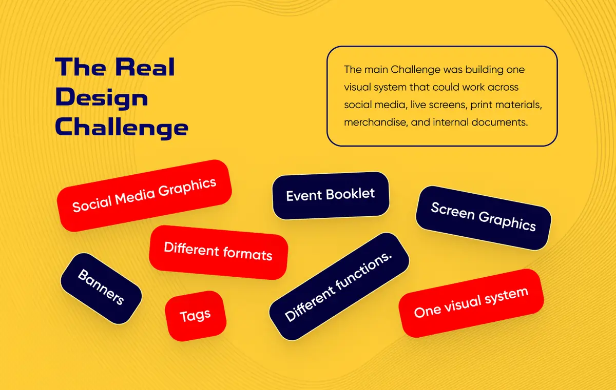
The challenge: make one system work everywhere.
Social media, live screens, print, merchandise and internal documents all do different jobs. Twelve teams, six days, and one identity that couldn't fall apart under pressure.
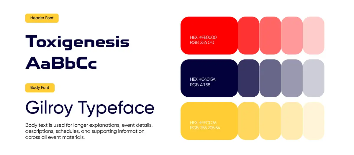
The system: contrast, rhythm and repetition.
A bold display face over a cleaner body typeface, with a compact three-colour palette that stays recognisable in long documents and loud promotion alike.
Red#FE0000
Navy#04013A
Yellow#FFCD36
Headlines: Toxigenesis · Body: Gilroy
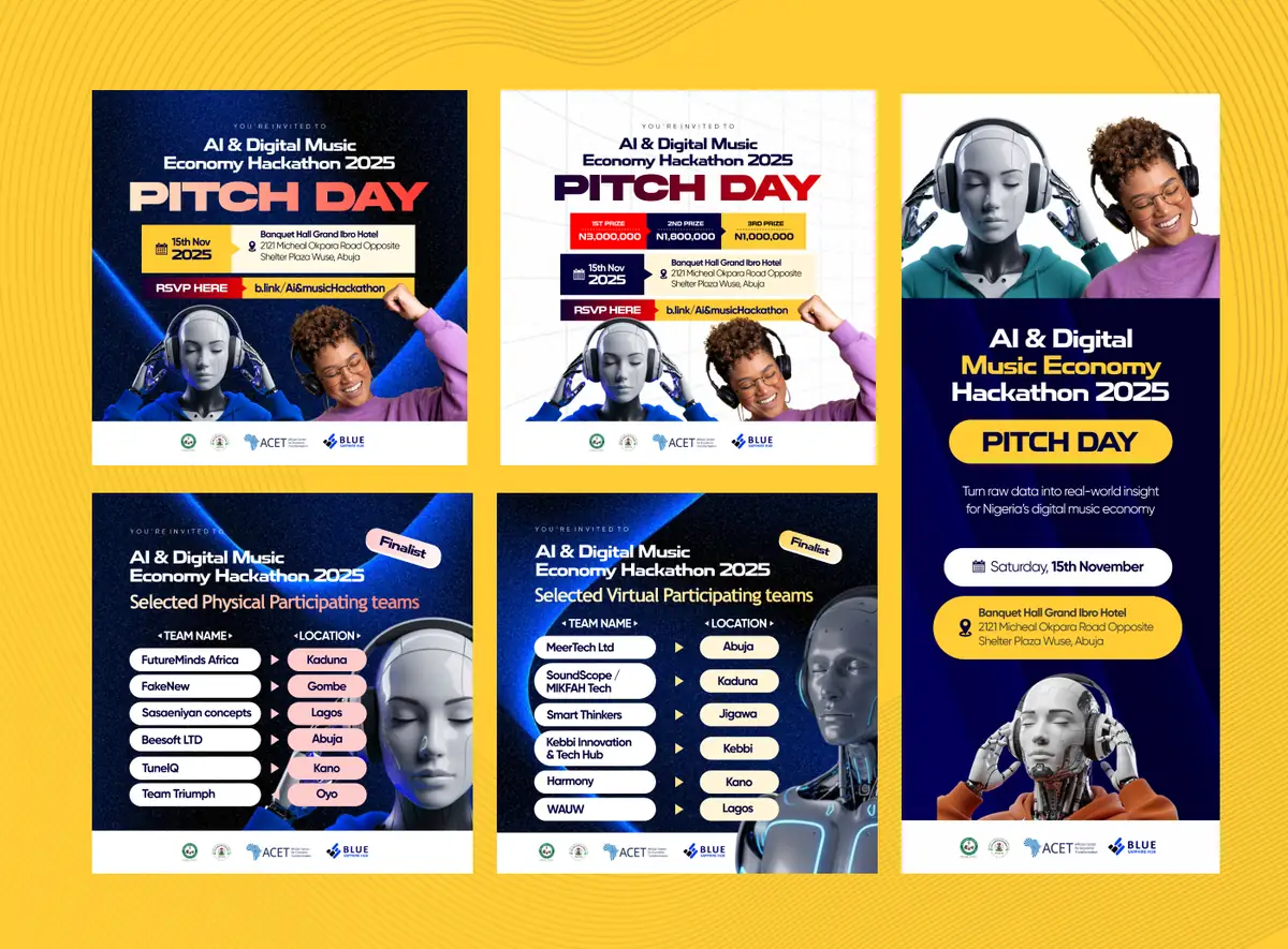
Flexible enough for every announcement.
Pitch-day invitations, participant announcements and event information share the same palette, hierarchy, imagery and layout logic, while carrying very different amounts of information.
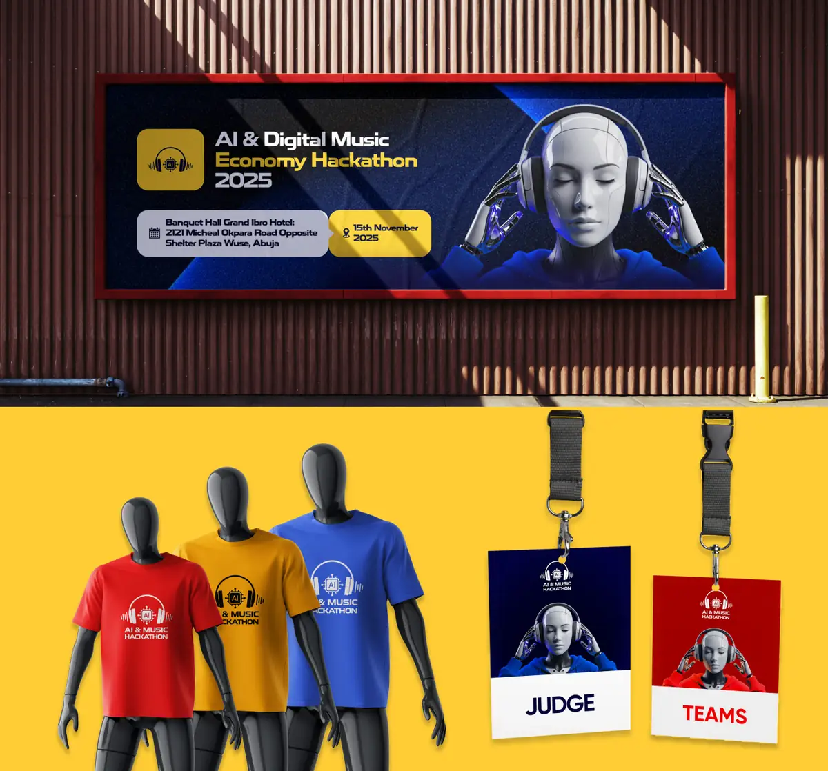
Into signage, apparel and badges.
The identity moved onto billboards, apparel and participant badges, so the same visual language carried from promotion into the room.
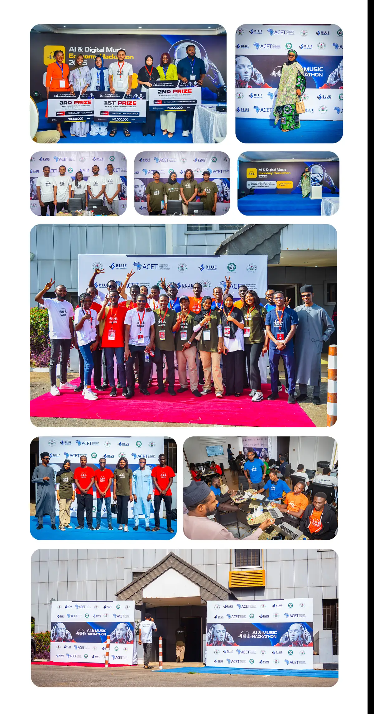
The system in the room.
Event photography shows the identity at work in real spaces: presentations, team sessions and branded moments throughout the hackathon.
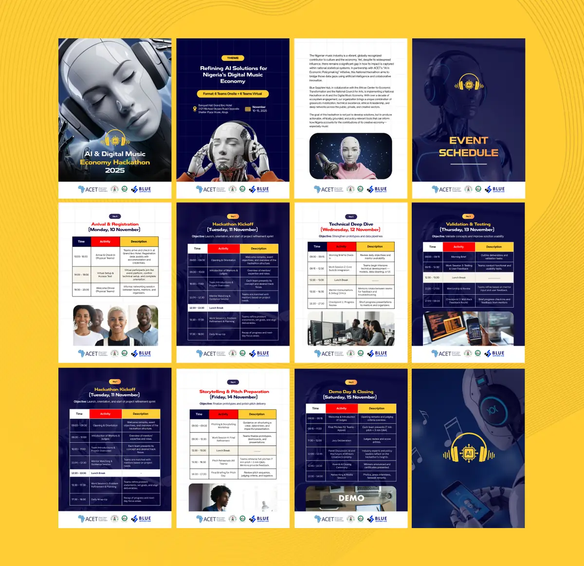
One identity, even when content gets dense.
The booklet and schedule had to carry detailed programme information without losing the identity. Repeated colour, type and image rules kept long documents connected to the promotional work.
The result: one system across every touchpoint.
The identity stayed recognisable across promotion, participant communication, merchandise, live spaces and programme material, without forcing every format to look the same.